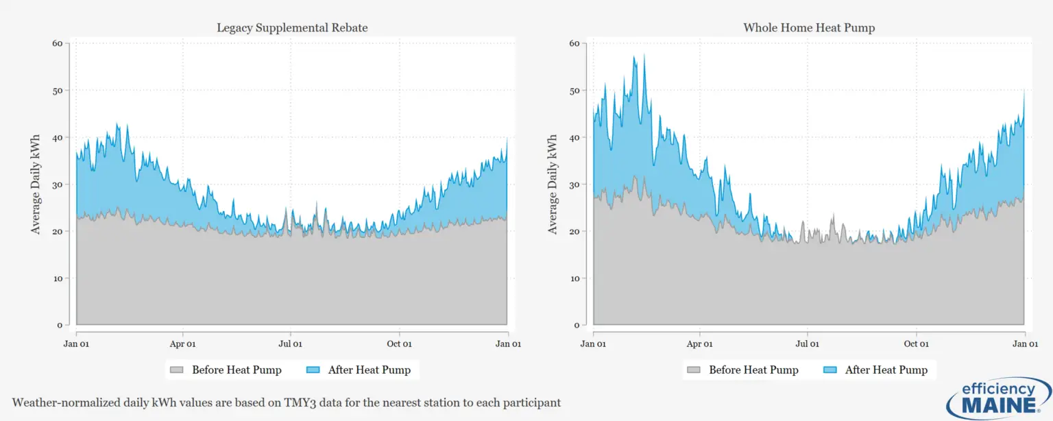
Heat Pump Performance in Maine Homes

Unlocking Hidden Grid Capacity: How Ecobee’s Grid Resiliency Service Delivered over 100 MW Across Three Markets this Summer
Traditional demand response (DR) programs have proven their value for grid reliability for years, but enrollment takes time. Building a large pool of participants requires sustained marketing, customer outreach, and equipment installation, which can take years to reach scale. Meanwhile, grid operators are increasingly in need of fast dispatchable resources during grid stress events where every megawatt counts.
What if utilities could access the Heating, Ventilation, and Air Conditioning (HVAC) demand flexibility of customers who were never enrolled in a DR program, and all it takes is owning a ecobee smart thermostat?
That’s the premise behind ecobee’s Grid Resiliency (GR) service, which Demand Side Analytics (DSA) evaluated across three major electricity markets during summer 2025. The results imply that auto-enrollment models can tap into substantial demand flexibility that traditional DR programs have been unable to reach.
The Study: Grid Resiliency Across CAISO, ERCOT, and SPP
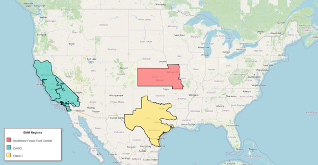
Ecobee’s Grid Resiliency service, which was deployed through the California Independent System Operator (CAISO) through the California Energy Commission’s Demand Side Grid Support (DSGS) program, the Electric Reliability Council of Texas (ERCOT) Emergency Response Service (ERS) program, and a direct utility demonstration with Evergy in Kansas and Missouri in the Southwest Power Pool (SPP) Market.
| Figure 1: Grid Resiliency Deployment by Market |
The GR service operates through ecobee’s eco+ platform, automatically enrolling customers who have enabled the Community Energy Savings feature but are not already participating in a utility DR program. When grid conditions become critical, the service temporarily adjusts thermostat setpoints by anywhere from 1 to 4 degrees for up to four hours. Customers get advance notifications and full opt-out control.
Across 11 events during summer 2025, the service called on over 143,000 unique devices and demonstrated 108 MW of load shift capability. The study sought to answer several key questions.
- How does this auto-enrollment approach perform compared to traditional programs?
- Is the response consistent across different markets and weather conditions?
- What is the nationwide potential for this resource?
How We Measured Performance
DSA applied market-specific evaluation protocols to measure the load impacts of GR. For CAISO (California’s Market), we followed the DSGS Option 4 protocol, creating four-day weather-matched baselines and applying day-of adjustments to account for any pre-event conditions. For ERCOT we developed regression models for each of the 8 climate zones using temperature, time-of-day, and historical non-event consumption patterns. For the Evergy demonstration in SPP, we implemented a “high 2-of-10” baseline methodology consistent with regional settlement practices.
In each case, we converted thermostat runtime data to demand estimates using region-specific connected load assumptions and calculated impacts as the difference between the baselines and actual consumption during the event windows.
Results: Consistent Performance
The GR service delivered load reductions across all three markets. ERCOT events achieved an average per-device impact of 1.05 kW across eight events, with peak reductions reaching 1.56 kW per device. The Evergy demonstration in SPP delivered 1.00 kW per device on average. CAISO’s two events operated under milder temperatures and longer four-hour dispatch windows, with weather-normalized per-device capability exceeding 0.5 kW. In aggregate, ERCOT events produced up to 78 MW of demand reduction per event, SPP delivered over 16 MW, and CAISO contributed 14 MW across its two events.
| Figure 2: Example Grid Resiliency Event (ERCOT) |
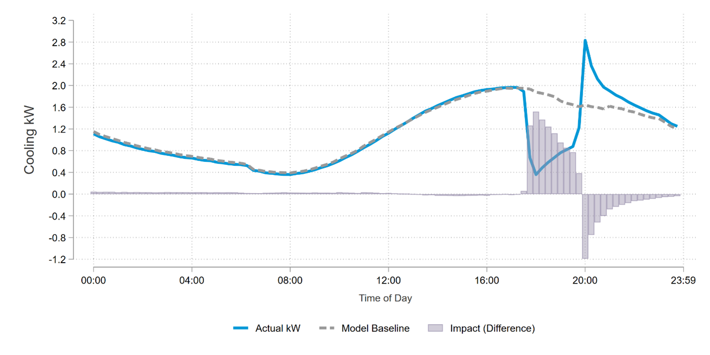 |
A key finding is that GR performance scales with temperature (which is often high in the case of grid stress). The July 30 ERCOT event at 94.4 degrees Fahrenheit achieved the highest per-device impact at 1.26 kW, while the September 25 ERCOT event at 79.6 degrees Fahrenheit produced the lowest at 0.58 kW. This alignment between resource capability and grid needs is precisely what operators look for in a critical capability resource. It delivers when conditions are highly stressed.
Figure 3: Average Event Participation across Markets
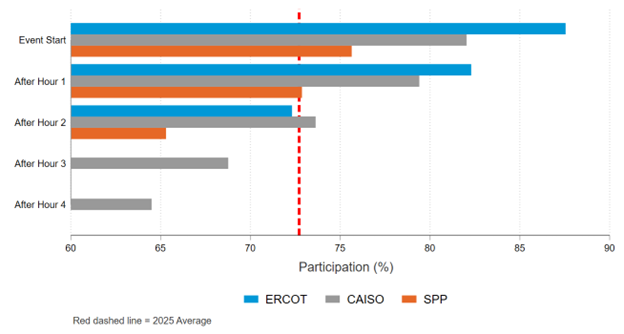
The most striking finding came from the participation data. Across all markets, events began with 75-88% enrolled devices participating, and two thirds remained active through event completion (a event attrition pattern typical of opt-in thermostat programs). The key difference being the GR service reaches devices that would not be participating in a utility program in the first place.
Why Auto-Enrollment Changes the Equation
Traditional DR programs require customers to take actions like responding to marketing, completing enrollment, and installing equipment. Even well-designed programs that aim to eliminate many barriers of entries can sometimes struggle in enrolling a large percentage of eligible customers. The remaining potential of unenrolled but willing customers remains untapped.
The GR service flips this traditional demand response enrollment model by leveraging devices already in customer homes and enabling participation by default. It reaches most eligible thermostats in each utility service territory and customers receive transparent notification of events and retain full control meaning they can opt out of an event at any time via their thermostat or ecobee mobile app.
This matters for several reasons. First, it expands the pool of capacity without additional marketing or incentive costs for utilities. Second, it provides a resource that can be deployed rapidly during emergencies without the lead time required to recruit and enroll new participants. Third, it captures value from customers who support grid reliability in principle but haven’t taken the steps to formally enroll in a program.
Looking Ahead
As part of this study, ecobee provided device count estimates of customers with the Community Energy Savings enabled. Based on our summer 2025 load impacts, we estimate that the nationwide capability of the GR service to be at about 2500 MW. This estimate assumes an average capability of roughly 0.8 kW per thermostat with regional adjustments and accounts for devices not currently enrolled in utility DR.
As grid stress events become more frequent, and electrification adds new loads, the value of fast, dispatchable demand-side resources will only grow. Auto-enrollment models like the Grid Resiliency service offer a solution to unlock untapped capacity. Creating a pathway for auto-enrollment could meaningfully expand demand response potential toolkit in many different markets.
DSA evaluated the ecobee Grid Resiliency service across CAISO, ERCOT, and SPP markets during summer 2025. For more information about this study or similar demand response evaluations, you can read the official report here or contact us for more information.
Forecasting Pennsylvania’s EV Future: Why Grid Planners Need to Pay Attention Now
As electric vehicles (EVs) roll into garages, highways, and loading docks across the United States, the power grid is facing a significant transformation. While most drivers are focused on how far their next charge will take them, grid operators are asking an equally important question: when and where is all this new EV charging demand going to hit the electric system?
Anticipating and managing these new loads is crucial. If done well, it could help utilities avoid costly and potentially unnecessary grid expansions. If left unaddressed, utilities risk being caught off guard by sudden spikes in electric demand, leading to overloaded feeders, service disruptions, and expensive last-minute infrastructure upgrades.
That is why the Pennsylvania Public Utility Commission (PA PUC) tasked DSA with developing a 15-year granular forecast of the impact of EV adoption as part of a statewide study on transmission and distribution (T&D) capacity. These forecasts can allow utilities to plan for future changes in demand while also identifying opportunities to defer or avoid infrastructure upgrades.
| Figure 1: Forecasted HE19 EV Demand across Pennsylvania in 2030 | |
| Figure A: PECO
|
Figure B: PPL
|
| Figure C: Duquesne
|
Figure D: FirstEnergy
|


We developed a granular, location-specific EV load forecast across the four major electric utility territories in Pennsylvania:
Step 1 – Forecast Statewide EV Energy Consumption
We used PJM’s zonal EV energy consumption forecasts to develop a 15-year projection of statewide EV energy consumption specific to the service territories of each of Pennsylvania’s four major electric distribution companies (EDCs).
Step 2 – Forecast EV Energy Consumption by Charging Type
We divided the total energy forecast into three main types of EV charging: light-duty vehicle (LDV) at home charging, LDV public/workplace charging, and medium- and heavy-duty vehicle (MHDV) charging. Each charging type was assigned a different hourly load shape; the LDV shapes were borrowed from NREL and the MHDV shape was borrowed from PJM’s electric vehicle forecast.
Step 3 – Estimate Feeder Propensity
After mapping feeders to locations, each feeder on the grid was assigned a propensity score for EV adoption and the three types of EV charging:
- LDV home charging: based on EV percent of current vehicle registrations by zip code (taken from PennDOT data)
- LDV public charging: based on nearby public charger locations (from AFDC data) and proportional to the quantity of public charging ports at each feeder
- MHDV charging: based on commercial property data for transportation-heavy industries, proportional to commercial square footage at each feeder
Step 4 – Calibrate to the Statewide Forecast
Using a calibration function developed by DSA, the forecasted EV growth for each utility was distributed across that utility’s feeders, ensuring that local adoption is calibrated to every location’s propensity and adds up to the utility-wide and statewide total forecasts.
Step 5 – Estimate Hourly Loads
Annual feeder-level EV MWh were converted to hourly loads using the normalized load shapes for each charging type. This enables planners to see not just how much demand will grow, but at what time during the day loads will peak on each circuit.
| Figure 2: Example of Projected Hourly EV Load for a Duquesne Feeder in 2025 and 2030 |
 |
This type of granular forecasting is key to identify T&D upgrade deferral opportunities or target T&D upgrades. Instead of making system-wide upgrades, utilities can use forecasts like these to invest where upgrades are really needed and avoid investments where they are not.
As Pennsylvania and other states prepare for rapid growth in electric vehicles, location-specific T&D forecasting will be essential to making smart, cost-effective infrastructure investment decisions.
Determining the Persistence of Home Energy Report Impacts
Demand Side Analytics has done multiple HER evaluations for many utilities; across a range of geographies, fuels, and cohort sizes. In this post, we review the results of a persistence study conducted in Pennsylvania after the conclusion of report delivery at four of FirstEnergy’s Pennsylvania Electric Distribution Companies (EDCs)[1]. The effect of treatment is typically measured through comparison of the group of customers receiving the HER, known as the treatment group, to a statistically identical control group. The comparison is done both in the period prior to receiving the reports (to assess treatment and control equivalence), and after treatment (to measure the impact of treatment on consumption). The goal of the study was to identify how long energy savings persisted, even after reports were discontinued.
What it is
Behavioral conservation programs, such as residential Home Energy Reports (HERs), are well understood to provide small, yet measurable reductions in energy use when appropriately deployed. These programs are relatively inexpensive, geographically widespread, and effective at reducing consumption for most residential customer segments. The treatment effect is related to behavior changes brought about by providing customers information about their energy consumption relative to their peers. By showing how much energy the customer is using compared to similar households, the HER induces behavior changes using the power of social norms. This effect is facilitated by having the HER provide energy efficiency and conservation tips to the customer, which induces temporary and permanent behavior changes. Because of this, the conservation effect can persist in treated groups even after customers stop receiving reports.
Why is it important
The persistence of HER impacts means that even after the discontinuation of HER delivery, treated customers continue to provide energy savings relative to customers who never received a report. Accurately quantifying how long savings persist in the previously-treated group is important as it helps determine program cost-effectiveness and assessments of the effective useful life of any HER program.
How did we do the analysis
The HER program in question was implemented as a randomized control trial for each of the EDCs. A randomized control trial is an evaluation technique that provides very precise and unbiased estimates of the effect of treatment – that is, the receipt of HER bill comparisons. If properly implemented, randomized control trials (RCTs) are a very effective framework for estimating HER impacts for two key reasons, related to how HER programs are designed:
- Expected effect size: Because the HER effect is generally small – on the order of 1-3% – the experimental design must be precise enough to detect the effect and must be able to account for any other factors that could bias energy consumption in the treatment group. By comparing consumption in the treatment group to the control group, external influences that are experienced by both the treatment and control groups are netted out of the treatment effect, reducing the amount of noise around the treatment’s impact
- Treatment duration: HER programs can run for many years; some Pennsylvania households have been receiving them for over five consecutive years. Over such a long period, many things can change at an individual home that would affect energy consumption (e.g., occupancy changes, renovations, or weather pattern changes). These factors are not all directly observed or measured, so they cannot be modeled and therefore may be misattributed to the effect of treatment in a regression. However, because these changes will equally affect the control and the treatment group, they will be netted out of an RCT impact estimate.
To isolate the impact of treatment while controlling other factors that may influence energy use, DSA applied a lagged dependent regression approach. This model works particularly well at providing precise savings estimates when there is good pretreatment equivalence between the treatment and control groups. The model uses information about individual household seasonal consumption patterns collected through billing data analysis to estimate the impact of treatment in each month after the start of report delivery, including after reports were stopped for the persistence test.
To model the effect of persistence, a simple regression specification was used to determine the decay of impacts as a function of the number of months since the cohort received their last report. Because impacts can be seasonal and have uncertainty around them, a weighted average of the prior year’s monthly impacts was used to create an average pre-cessation savings level.
The key metric used to quantify the effect of persistence is how many months it takes for impacts to reach zero. Once the regression is performed, DSA used the intercept and slope from the regression output to calculate the number of months it would take for the trend in impacts to go to zero. This is shown graphically below, where it takes approximately 37 months for the orange trend line to cross the y-axis at zero. The intercept for the persistence regression line is set equal to the average savings in the prior 12-months (shown in blue circles and the grey squares at month = 0). The underlying assumption with this model is that the HER savings will continue to decay at the same rate observed in months 1-24 until reaching zero.
Figure 1: Persistence Modeling Example

Program-specific considerations
Each EDC studied in this project had multiple cohorts of customers that were included in the HER program and persistence study. Not all of these cohorts showed robust pretreatment equivalence. Because of this, it is best to carefully consider which cohort’s impacts should be included in an analysis of HER persistence. The criteria that DSA used to categorize cohort quality were threefold:
- Pretreatment equivalence must be established: Without this condition, the lagged seasonal regression model cannot provide unbiased estimates of the savings associated with a HER program.
- The cohort must be large enough in the persistence period to provide a precise impact: Cohorts with 10,000 or more unique – and active – customers after June 2016 provided enough information to ensure that impact estimates during the persistence period could be estimated precisely.
- Enough of the original cohort must remain active through the persistence period to feel confident in the internal validity of the impact: It is possible that there were systematic reasons for customer account churn in the persistent cohorts, which could create a biased estimate of the cohort’s savings. In other words, if customers who left the group responded to the HERs differently than customers who remained active, the overall cohort’s result would reflect only customers who remained active if enough other customers left. We focused our efforts on cohorts that had at least 50% of their original size still left by the persistence period.
These criteria are illustrated graphically in Figure 2 for one of the EDCs. The x-axis plots the average number of customers still active in the period between June 2016 and May 2018 for each cohort, while the y-axis shows the percentage of the original cohort size that is still active during this period. The markers for each cohort are also color-coded to highlight whether the cohort was used in the final analysis, or what the reason was for its exclusion.
Figure 2: Cohort Characterization for Met-Ed

What are the results
The cohort characterization resulted in five cohorts analyzed in the persistence study: two from Met-Ed and three from Penelec. The five cohorts that qualified were then fed into a second-stage model that sought to determine the monthly decay rate of the savings estimates. Since there is noise in each savings estimate and seasonal variation in the savings estimates, DSA thought it most appropriate to set the intercept of each cohort’s regression to equal the average savings percentage over the twelve months immediately prior to the persistence test. That is, the starting point of this regression was not simply what the customers saved in May of 2016 but a weighted average of the full year prior to the test. Figure 3 shows the raw data used to construct this analysis. The five cohorts that were identified as having good equivalence and the appropriate cohort size are shown in the figure below. The trend line of persistent savings is shown in blue. This figure displays the trend for FirstEnergy cohorts only and approaches zero nearly 30 months after the HER reports stop being sent to customers. This estimate is combined with other Pennsylvania studies, below, to provide an overall decay rate estimate.
Figure 3: FirstEnergy Persistence Trends

To estimate the HER effect duration more precisely, DSA fit a simple linear model that related the percent savings estimates – again weighted by the aggregate reference load – to the number of months it had been since the cohort received a HER. The weighting of the percent savings is necessary in this case because we are using percent savings as our variable of interest. Doing the weighting ensures that larger cohorts are have more impact than smaller ones, and that a 2% savings in a high-consumption month counts more than a 2% savings in a low-consumption month, while still creating a percentage metric that can be directly compared to other studies.
Table 8:Persistence Trends by Cohort

How do these results compare to a larger set of recent HER persistence studies?
In 2015, the Pennsylvania evaluation team conducted a similar analysis of residential HER persistence for cohorts from PPL and Duquesne Energy that stopped receiving HERs. Three cohorts across these two EDCs experienced between 16 and 24 months of no report delivery, with resumption of HERs after that period had passed. Prior to having begun the persistence test, the two PPL cohorts had received reports since 2010 (Legacy), and since 2011 (Expansion). Duquesne’s HER program began in PY4 (between June 2012 and May 2013), so at most customers received 11 months of HER treatment prior to report discontinuation.
Table 9:Persistence Trends for Other Pennsylvania HER Studies

In general, the FirstEnergy results are quite similar to those of the two PPL cohorts, with between 29.7 to 51 months of expected impact decay time. The PPL customers in the HER program had been receiving reports for a longer period than most FirstEnergy customers, but had generally similar savings rates prior to the start of the persistence test. This generally corresponds to the common understanding of HER reports; namely that they can deliver relatively consistent savings after a maturation period of one to two years when customers first start receiving reports. The decay rates, or slope of percent savings decay, in the PPL study is quite similar to that of FirstEnergy, with between a 0.04% and 0.06% drop in savings per month (roughly a 0.5% to 0.75% annual decay).
[1] The full report can be found here: http://www.puc.pa.gov/Electric/pdf/Act129/SWE_Res_Behavioral_Program-Persistence_Study_Addendum2018.pdf
Electric Vehicle Penetration in New York
Electric vehicles penetration and electrification has been a subject of much debate and discussion recently. Like many other States, New York has been grappling with setting policy regarding electric vehicles.
- How quickly will electric vehicle adoption ramp up?
- What are the implications for distribution planning?
- Should they offer State rebates to encourage electric vehicle adoption?
- Should utilities be involved in the business of building fast charging stations for electric vehicles?
To assess the current penetration and concentration of electric vehicles, we relied on publicly available vehicle registration data for each of 11.7 million vehicles in New York, including VIN numbers, zip codes, dates of registration and host of other factors. Once we remove boats, motorcycles, and ATVs from the dataset, narrow down to National Grid zip codes, and remove 2018 models (since the data for that year is partial), we have roughly 9.4 million vehicles in National Grid’s New York territory. To supplement the vehicle registration data, we used a VIN decoder API (to isolate the make, model, trim, engine type, model year, and other characteristics for all of the vehicles registered in New York. This allowed us to identify all electric vehicles (EV’s), plug-in hybrid electric vehicles (PHEVs) and hybrids. The datasets were used to understand EV adoption trends in National Grid’s NY service area.
What Do We Know About Electric Vehicle Penetration So Far?
The most common type of plot for electric vehicle penetration is shown below. It shows total all-electric vehicles registered in National Grid’s NY territory by model year.

At first glance, electric vehicles adoption is accelerating quickly. However, it is important to place electric vehicle penetration in the context of all vehicles in National Grid’s NY territory. The two charts below show the percentage of vehicles in National Grid’s NY territory by model year that are all electric, and the total vehicles by type and model year. As percentage of total 2017 vehicles, electric vehicles are ab0ut 0.25%.


Of the 9.4 million cars in National Grid’s NY territory roughly a million are new each year. As vehicles age, the count of vehicles goes down, either because they are retired or resold outside of National Grid’s NY territory. The pattern below is critical. For electric vehicle penetration to matter, the new car market share of electric vehicles must grow. Second, the penetration of electric vehicles won’t be instantaneous simply because only a relatively small share of individuals purchase and drive new vehicles.
The penetration of green cars in general is instructive. For simplicity, we group hybrids, plug in electric hybrids, and all-electric vehicles into the broader green car category. Like electric vehicles, federal and state rebates were offered for hybrid vehicle adoption. Hybrids are not perfectly analogous – there are differences in performance, drive feel, range, costs, and long run costs – but it’s the most similar well-developed technology. The figure below shows green vehicle adoption by model year. For reference, the data is shown as the percentage of vehicles in each model year. While hybrids have been around nearly 20 years, their penetration appears to have already peaked at roughly 2% of new vehicles purchases. A key question is whether electric vehicles will drive up the overall share of green cars or if we will see a shift from hybrids and PHEV’s vehicle purchases to electric vehicles. It is also instructive to understand the mix of vehicles. While hybrids were dominated by Toyota, the EV and PHEV market is far more open, with a wider mix of car manufacturers vying for market share.


Are Electric Vehicle and Green Car Penetration Deeper in Specific Locations?
Below, we show two heats maps. The first compares the aggregate penetration of electric vehicles and PHEVs by zip code. The second heat map shows the current penetration of green cars overall – including EV’s, PHEVs and hybrids – by zip code.

Penetration of EV + PHEV vehicles (%)

Penetration of Green Vehicles (%)
The chart below compares the penetration of electric vehicles and PHEVs to the penetration of hybrid cars in National Grid’s NY territory. The size of the bubbles indicates the total number of vehicles registered in each zip code. Not surprisingly, adoption of electrified vehicles is closely related to penetration of hybrids. Basically, we can expect higher penetration of electric cars in areas where their predecessors, hybrids, have high penetration.

The two charts below show the areas with the highest penetration of EV+PHEV’s in National Grid’s New York territory. Three digit zip codes typically center on larger cities and towns.


What Conclusions Can We Draw?
The analysis here is not about prognosticating the future of electric vehicles. The data thus far does not reflect the impact of the Tesla Model 3, which may or may not be a truly disruptive technology. What we know so far is the following:
- Electric vehicle penetration as a percentage of all vehicles is small but growing.
- Green vehicles in National Grid seem to be limited to roughly 2% of new vehicle purchases.
- Some locations have higher electric vehicle and PHEV adoption rates.
- Electric vehicles are going where the adoption of green vehicles is higher.
- The data to closely monitor and understand electric vehicle penetration is available, at least in New York.
Pennsylvania Transmission and Distribution (T&D) Avoided Cost Study
Demand Side Analytics (DSA) conducted a transmission and distribution (T&D) avoided cost study in Pennsylvania. The focus of the study is on quantifying the change in T&D costs associated with an increase or decrease of kW coincident with location-specific peaks. It employs methodologies that are novel for Pennsylvania but have been applied and approved in New York and California for load forecasting and distributed energy resource (DER) valuation. The full study is available online here.
A vital role of the Electric Distribution Company (EDC) is to ensure that regional electricity supply makes its way to homes and businesses safely, reliably, and cost-effectively. By projecting future demand and reinforcing the local transmission and distribution network so that sufficient capacity is available to meet local needs as they change over time, costly outages are avoided.
What are the objectives of the study?
The study was designed to meet the following objectives:
- Analyze load patterns, excess capacity, load growth rates, and the magnitude of expected infrastructure investments at a local level
- Model location-specific forecasts of growth with uncertainty
- Quantify the probability of potential need for infrastructure upgrades at specific locations
- Calculate local avoided distribution costs by year and location
- Identify beneficial locations for demand reductions
Which methods did we use?
The deferral value approach focuses on quantifying the value of load relief on ratepayer costs (i.e. revenue requirements). It effectively compares revenue requirements with and without load relief. While infrastructure upgrades can be temporarily avoided or deferred via load relief, they cannot be avoided indefinitely because equipment eventually ages and needs to be replaced. The marginal cost of service study approach quantifies the supply cost of additional distribution or transmission capacity on the system. At the simplest level, it involves classifying infrastructure investments as growth related or not and dividing the costs of those investments by the incremental transmission or distribution capacity added. The approach uses the cost of adding additional transmission capacity to the system as a proxy for the cost avoided by reducing peak demand.
Figure 1: T&D Avoided Costs Methods Considered

What did we do?
Figure 2 describes the main steps in developing location-specific avoided distribution costs using probabilistic methods. These steps help identify the magnitude of reductions at the right location at the right time and right season to delay upgrades. The process was implemented for each feeder and substation (transformers or terminals if applicable) that had a valid growth rate and operating limit, then layered two levels to get the distribution avoided cost for each site. For system-wide values, the estimates consider the likelihood that reductions would be in locations with or without value due to random chance. We emphasize that system-wide value is a load-weighted average of areas where reductions do or do not lead to deferral of distribution investments.
Figure 2: Key Steps in Estimating Location Specific Avoided Costs

What are the results?
The avoided cost of transmission capacity estimates simply increases with inflation and escalation. The avoided cost of distribution capacity values changes at varying rates based on the outcomes of the probabilistic deferral analysis methodology.
While the final study outputs are territory-wide average values for each EDC, the granular forecasts are useful for identifying locations and timing when demand reductions or injections of distributed generation are beneficial. Figure 3 shows the total deferral value by local systems. Shades of blue indicate relatively low deferral value while orange and red tones indicate high deferral value. The values range from a lower bound of $100 to a maximum of $200 in 2026 nominal dollar. To calculate the total deferral value, we aggregated the deferral value at feeder and substation levels, then incorporated the deferral value of transmission. A key outcome of the study was to highlight the fact that the avoided T&D costs associated with peak load relief vary widely within each EDC territory.
The value of avoided T&D costs associated with an increment or decrement of peak load is a key component of benefit-cost analyses. In practice, T&D capital costs resources are concentrated in pockets that are experiencing growth but lack the capacity to accommodate additional growth. Most utilities have a mix of areas where loads are growing and areas where loads are declining, which may or may not overlap with highly loaded components. In locations with excess distribution capacity or where local peak demand is declining, the potential to avoid T&D costs is minimal. In areas where a large, growth‐related investment is imminent, the avoided T&D costs from reducing peak demand are much higher.
Figure 3: Heat Map of Total Deferral Value ($2026/kW-year)

What did we find?
![]() Load growth varies by location. Some pockets are experiencing load growth, and some are experiencing load decreases. We received granular growth rates for PECO, PPL, and FirstEnergy. In each EDC territory, growth trends varied by location. As a result, growth-related T&D investments are required even when overall EDC loads are flat or declining.
Load growth varies by location. Some pockets are experiencing load growth, and some are experiencing load decreases. We received granular growth rates for PECO, PPL, and FirstEnergy. In each EDC territory, growth trends varied by location. As a result, growth-related T&D investments are required even when overall EDC loads are flat or declining.
![]() The T&D avoided costs are concentrated in locations that are more heavily loaded. A key component of distribution planning is the loading factor: the weather-normalized peak demand divided by the operating limit. Not surprisingly, avoided costs are concentrated in more highly loaded locations. Conversely, locations with ample capacity to accommodate additional loads had lower avoided T&D costs.
The T&D avoided costs are concentrated in locations that are more heavily loaded. A key component of distribution planning is the loading factor: the weather-normalized peak demand divided by the operating limit. Not surprisingly, avoided costs are concentrated in more highly loaded locations. Conversely, locations with ample capacity to accommodate additional loads had lower avoided T&D costs.
![]() Individual locations are generally winter or summer peaking, not both. Most distribution locations – feeders, transformers, substations – can be classified as winter or summer peaking. Few feeders are dual peaking. The implication is that the avoidable T&D cost for a specific location is concentrated in the summer or winter, but not both.
Individual locations are generally winter or summer peaking, not both. Most distribution locations – feeders, transformers, substations – can be classified as winter or summer peaking. Few feeders are dual peaking. The implication is that the avoidable T&D cost for a specific location is concentrated in the summer or winter, but not both.
![]() Resources that deliver load relief at the right location, in the right season, and at the right hours are more valuable. The same energy efficiency resource can deliver different T&D benefits at two locations based on how well it coincides with the local peak load. To illustrate, a more efficient air conditioner does not provide T&D load relief on a winter-peaking substation but does so on a summer-peaking substation. Likewise, measures with load shapes that better coincide with the need for load relief are more valuable.
Resources that deliver load relief at the right location, in the right season, and at the right hours are more valuable. The same energy efficiency resource can deliver different T&D benefits at two locations based on how well it coincides with the local peak load. To illustrate, a more efficient air conditioner does not provide T&D load relief on a winter-peaking substation but does so on a summer-peaking substation. Likewise, measures with load shapes that better coincide with the need for load relief are more valuable.
![]() Lump loads are a key driver of distribution upgrades. Lump loads are simply new, large loads. They vary widely in size, and it can be difficult to predict in advance when and where they will show up. When they are built, they often trigger distribution and even transmission upgrades. Reducing demand via EE&C program efforts can create room for additional loads and help avoid upgrades due to smaller lump-load projects.
Lump loads are a key driver of distribution upgrades. Lump loads are simply new, large loads. They vary widely in size, and it can be difficult to predict in advance when and where they will show up. When they are built, they often trigger distribution and even transmission upgrades. Reducing demand via EE&C program efforts can create room for additional loads and help avoid upgrades due to smaller lump-load projects.
The Pennsylvania PUC leveraged the results of the study for its 2026 TRC Test Tentative Order. The TRC Test Order provides utilities with directions for calculating avoided costs and performing benefit-cost analysis when planning for Phase V of Act 129 programs. The avoided T&D values will play an important role in the Phase V DR Potential Study, which DSA is currently working on.
Meter-Based Methods from Coast to Coast
Demand Side Analytics (DSA) recently conducted two similar studies on the accuracy of using smart meter data for evaluation and settlement of energy efficiency (meter-based methods). Different localities refer to these meter-based methods with distinctive terminology. Across our two studies, California[1] (for Pacific Gas & Electric) refers to these methods as normalized metered energy consumption (NMEC) while Vermont[2] (for the Vermont Department of Public Service) refers to them as Advanced Measurement & Verification (M&V).
While these studies were distinct, they were both concerned, to varying degrees, with:
- Estimating energy efficiency (EE) program impacts.
- Assessing the accuracy of meter-based methods.
- Providing recommendations for the types of populations, interventions, and locations where meter-based methods should be applied.
What follows is a review of the benefits of using meter-based methods for estimating EE program impacts, a brief overview of each study’s goals, and our findings.
What are Meter-Based Methods?
The primary challenge of estimating energy savings is the need to accurately detect changes in energy consumption due to the energy efficiency intervention, while systematically eliminating plausible alternative explanations for those changes. Did the introduction of energy efficiency measures cause a change in energy use? Or can the differences be explained by other factors (such as the effects of the COVID-19 pandemic)? To evaluate energy savings, it is necessary to estimate what energy consumption would have been in the absence of program intervention—the counterfactual or baseline.
Meter-based methods rely on whole-building, site-specific electric and/or gas consumption data, either at the hourly or daily level. This data is used to estimate energy savings associated with the installation of individual or multiple energy efficiency measures (EEMs) at the site.
Why rely on Meter-Based Methods?
Many methods exist to estimate savings associated with EEMs, all with varying degrees of modeling complexity, data requirements, accuracy, and precision. The benefits of using meter-based methods include:
- Eliminating the need for sampling because data is available for nearly all participants.
- Reducing the burden on participants because technicians don’t need to visit the home or business to install metering equipment.
- Producing faster feedback on energy-saving performance.
- Enabling program administrators to look beyond the average customer and explore how savings vary across segments of interest.
- Opening new opportunities for program design and delivery (i.e., pay-for-performance programs).
- Producing granular savings estimates that are useful for a wide range of planning and valuation functions.
California
Pacific Gas and Electric Company (PG&E) currently uses the CalTRACK Version 2.0 method (CalTRACK) to estimate avoided energy use for its energy efficiency programs based on the Population-Level NMEC methodology. A notable feature of the population NMEC method has been the lack of comparison groups, which are used to adjust the energy savings baseline and normalize the savings estimate for factors beyond weather. The pre-post method without a comparison group relies almost exclusively on weather normalization and effectively assumes that the only difference between the pre- and post-intervention periods is weather and the installation of EEMs. The COVID-19 pandemic laid bare the limitations of the adopted method. The pandemic led to changes in our commutes, business operations, and home use patterns. Not surprisingly, it has also changed how, when, and how much electricity and gas we use. Moreover, the impact on energy use differs for residential customers and various types of businesses.
Given the changes in energy consumption that have occurred over the course of the COVID-19 pandemic, the need for alternative approaches to CalTRACK and similar, simple pre-post regression methods for estimating EE impacts is paramount. While adding comparison groups typically improves the accuracy of these energy saving estimates, there are three main logistical challenges:
- Privacy of non-participant customer data. Current California laws and regulation exist to protect the privacy of advanced metering infrastructure (AMI) or smart meter data for individual customers.
- Transparency Challenges. Many evaluation methods that rely on a comparison group require extensive calculation in order to construct the group. This complexity can hinder independent review and/or replication of the findings.
- Complexity and frequency. PG&E and third-party EE program implementers target a wide range of customer segments and geographic areas, each of which require regular and specifically targeted non-participant data for evaluation. This is a proposition that adds complexity to existing program administration processes.
To determine if there are viable alternative models that can accommodate the effects of the COVID-19 pandemic or other wide-scale non-routine events, DSA conducted an accuracy assessment of the existing Population NMEC methods as well as a variety of other methods with and without comparison groups.
What did we do?
Accurate and unbiased estimates of energy efficiency impacts are critical for utility program staff, third-party program implementers, and regulators. In evaluating the accuracy of the existing Population NMEC methods used in the PG&E territory, we tested a variety of other methods, with and without comparison groups, to simulate a competition and identify the methods that are unbiased and accurate (Figure 1).
The accuracy of these methods are assessed by applying placebo treatment on customers that did not participate in EE programs during the period analyzed. The impact of a program (or in this case, a pseudo-program) is calculated by estimating a counterfactual and comparing it to the observed consumption during the post-treatment period. Because no EEMs were installed in this simulation, any deviation between the counterfactual and actual loads is due to error. The process is repeated hundreds of times – a procedure known as bootstrapping – to construct the distribution of errors.
Figure 1: General Approach for Accuracy Assessment

What did we find?
- Population NMEC methods without comparison groups cannot account for the effects of the COVID-19 pandemic
- The existing population NMEC methods without comparison groups show upward bias even prior to the effects of the pandemic.
- Comparison groups improve accuracy of the CalTRACK method.
- When constructing a matched control group, the choice of segmentation and matching characteristics matter more than the method of matching customers.
- Synthetic controls may perform well but are highly sensitive to the choice of segmentation used.
- Using aggregated granular profiles instead of individual matched controls in Difference-in-Differences methods yields comparable results to using individual customer matched controls.
- Accuracy and precision are dependent upon the number of sites aggregated together (Figure 2)
Figure 2: Distribution of Error across Comparison Groups

- No method is completely free of error.
Given these findings, rather than try to produce a single prescriptive method for NMEC analyses of energy efficiency programs, we instead recommend a framework by which proposed NMEC methods can be tested, certified, and used to estimate savings:

Vermont
The primary objective of the Hourly Impact of Energy Efficiency Evaluation Pilot was to better understand the time-value of energy efficiency measure savings and the implications for program design, delivery, and evaluation. Because energy efficiency in the Northeast qualifies for capacity value, accurate estimates of the contribution of energy efficiency to peak hours is critical. Using high-frequency 15-minute consumption data from Green Mountain Power’s AMI and program tracking data from Efficiency Vermont, the study team modeled energy consumption of participating homes and businesses separately in the pre-installation and the post-installation periods. These two periods were compared to understand how consumption changed following installation of an energy efficiency or beneficial electrification measure. A secondary objective of the study was to compare Advanced M&V methods, or regression-based modeling of utility meter data, with the approaches traditionally used in Vermont. This comparison helped to determine where Advanced M&V could offer cost savings, improve the accuracy and granularity of savings estimates, and identify lessons for program operations.
What did we do?
To generate savings for the 21 prescriptive measures and the 124 custom projects in Vermont, we implement Advanced M&V procedures that build upon the International Performance Measurement and Verification Protocol (IPMVP) Option C Whole Facility approach to energy savings estimation. We do this through a regression model that follows Lawrence Berkeley National Laboratory’s (LBNL) Time-of-Week Temperature (TOWT) Model, where the dependent variable is hourly electric consumption from the meter and the independent variables contain information about the weather, day of week, and time of day.
This methodology estimates efficiency impacts in each hour of the year. Granular results provide insight into the distribution of energy savings across a year. For example, Figure 3 shows a heat map of the average energy savings from installing a variable speed heat pump. This measure’s model estimates a large load increase during the winter months (blue regions). Negative savings is a good thing in this case because it means Vermont homes are using the heat pump for heating and displacing delivered fuel consumption. There is also a pocket of denser load increase in the summer months during the middle of the day (orange regions), presumably due to homes that may not have had air conditioning previously using the heat pump as an air conditioner.
Figure 3: Variable Speed Heat Pump Heat Map

What did we find?
- Modelling success for prescriptive measures is a function of effect size and number of participants.
- Challenges are present when using Advanced M&V for “market opportunity” measures, where the baseline is a hypothetical new piece of equipment with code-minimum efficiency. This assumption creates issues because the pre-installation meter data reflects the replaced equipment at the end of its useful life.
- For custom projects, Advanced M&V methods work best for sites with predictable load patterns and large savings as a percent of total consumption (Figure 4).
Figure 4: Example of a Well-Behaved Custom Project
- With the level of noise present, we caution against using site-specific results to determine incentive levels in Vermont and suggest Advanced M&V is more useful as a program evaluation tool.
- Advanced M&V is a powerful tool, but it is not the right tool for every job.
Given these findings, to have a chance at accurately and precisely estimating savings from efficiency measures, the guidance below must be taken into consideration:
- https://pda.energydataweb.com/api/view/2587/PGE_NMEC_Accuracy_Assessment_Report_02-15-2022.pdf ↑
- https://publicservice.vermont.gov/sites/dps/files/documents/VT%20PSD%20Hourly%20Impact%20of%20Efficiency%202021.pdf ↑